
what you'll learn...
overview
In this page, the following are explained.
• Reading a bar-graph of given data
• Representation of two sets of data using bar-graphs
• Representation of data using pie-charts
recap
The figure is a bar-graph representation of a data.
The data is represented with horizontal or vertical bars.
This representation is spatially laid out for users to easily understand comparative measures like
which one is the largest
which one is the smallest
which ones are comparatively equal.
reading a bargraph
Consider the data: Number of glasses of water students drink during the school time. The data can be given in bar-graph with, the number of students in vertical axis and number of glasses in horizontal axis.
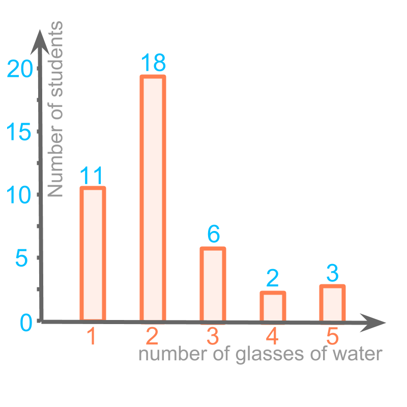
The bar graph representation is given in the figure. The horizontal axis is the number of glasses and the vertical axis is the number of students. The height of each bar is given for clarity.
A bar of height at position provides information that students had glass of water.
The height of bar at the position glasses water is . That indicates, students drank glasses of water.
another bargraph
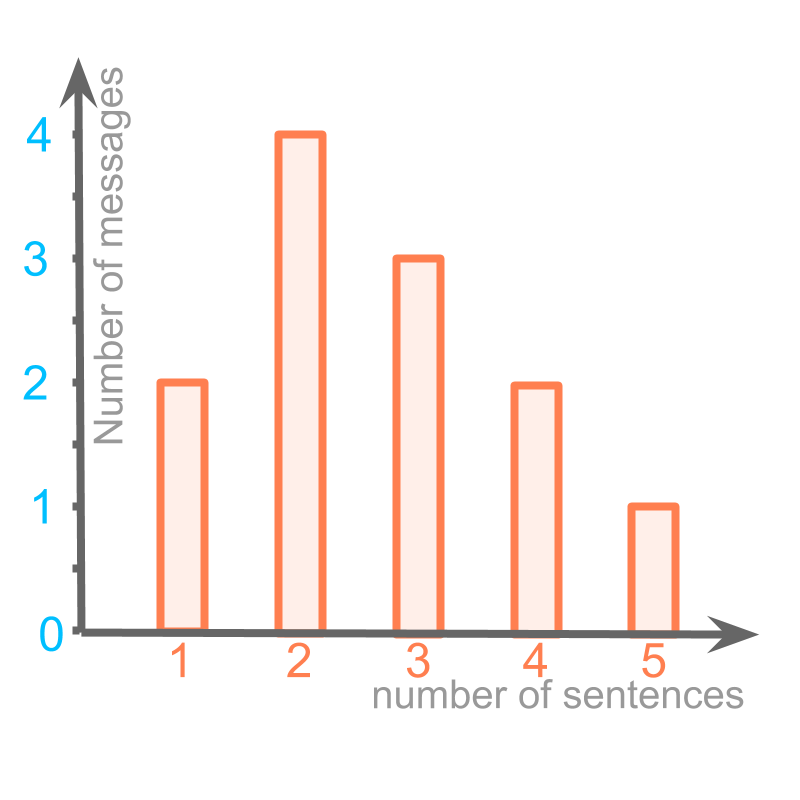
Consider the given bar graph. This represents the messages sent by a person. The data is number of sentences in a message and the number of messages with the given number of sentences.
The height of bar at the position (number of sentences) is number of messages. That indicates that, messages were sent with sentence each.
The message of highest frequency is represented by the tallest bar. For the tallest bar, the number of sentences is (the value on horizontal axis).
So, The message of highest frequency has sentences.
It is noted that, single sentence and sentence messages have the same frequency
summary
Reading a bar graph: With the meaning attributed to horizontal axis and vertical axis, the position and height of each bar is read.
The objective is to answer any comparative or quantitative questions about the data using the given bar graph.
bargraph with two sets of data
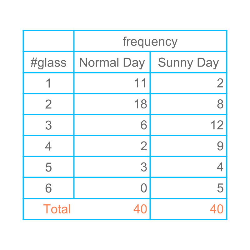
Consider the data: Number of glasses of water students drink during the school time.
The data is collected for normal days and hot-sunny day. These two data sets differ.
Let us understand how two sets of related data be represented with a bar-graph.
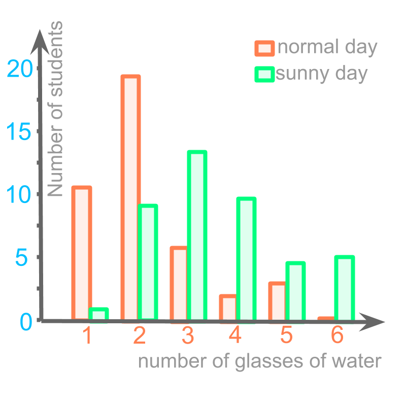
The data is captured in the bar graph.
Orange color bars represent data for normal day.
Green bars represent data for sunny day.
The data in this bar graph can also be read for details and compared.
Comparing normal day and sunny day, The increase in number of students who had glasses of water is .
summary
Multiple Data in a Bar-Graph : Multiple sets of data can be plotted in a single bar graph.
Such bar-graphs are also used to answer any comparative or quantitative questions.
Pie Chart
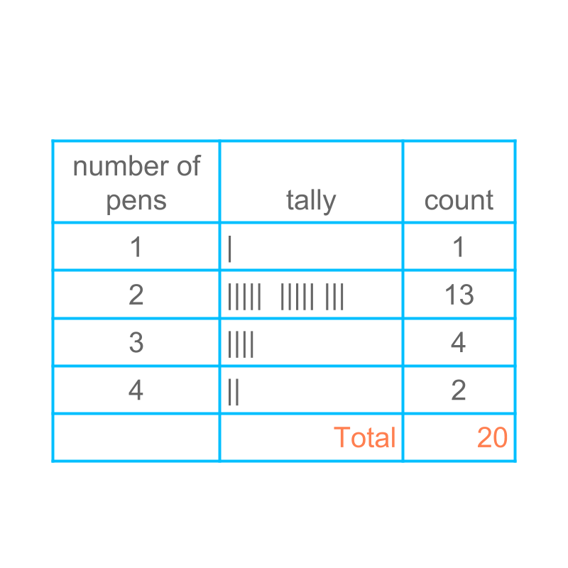
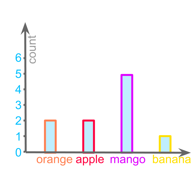
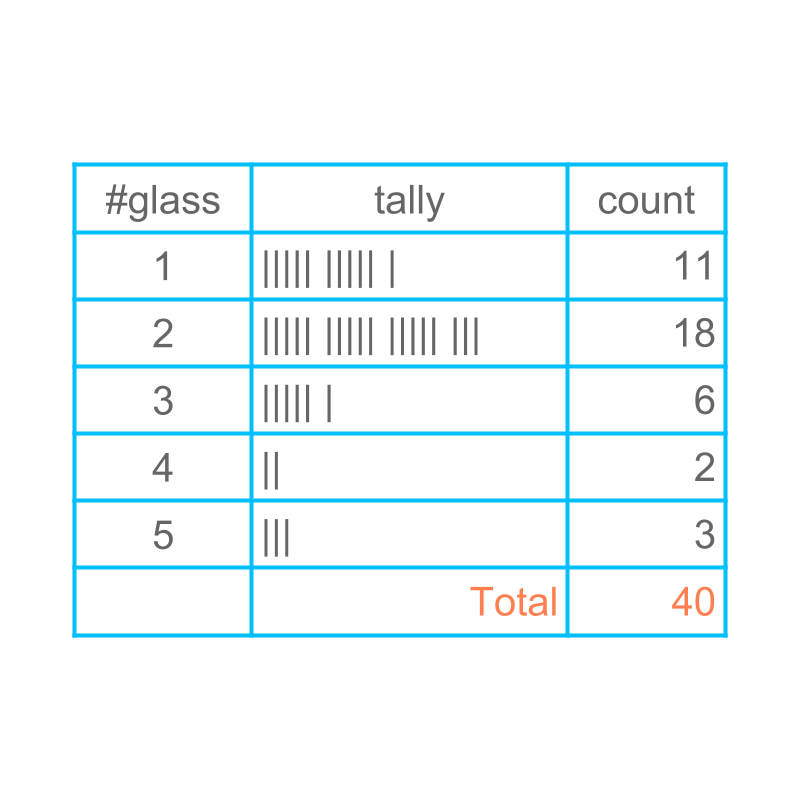
Consider the number of pens a student carries in a group of students. The raw data is given as :
, , , ,
, , , ,
, , , ,
, , , ,
The figure provides the tally and tabular representation of the given raw data.
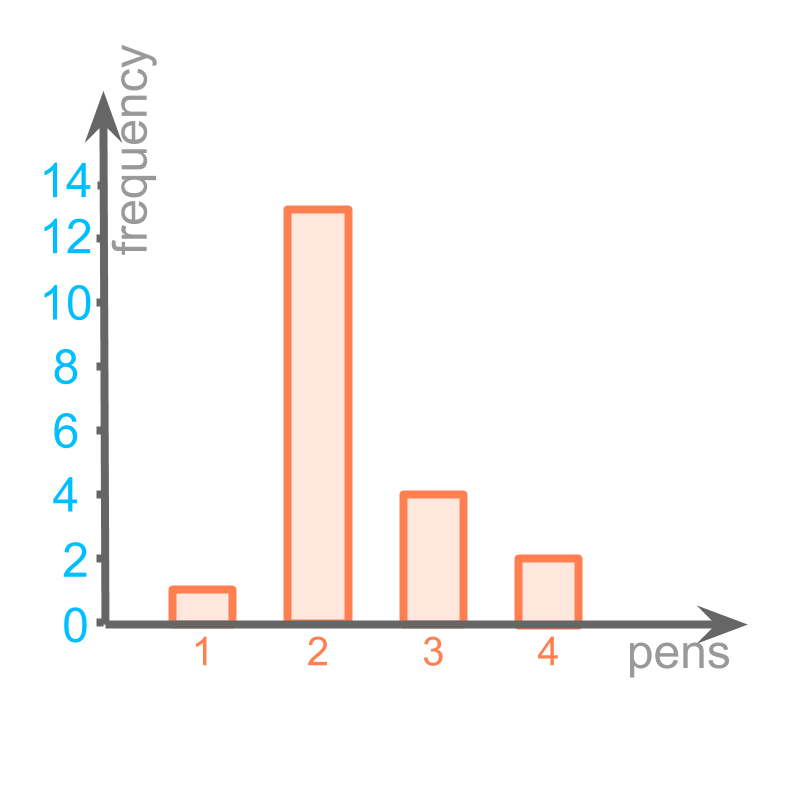
The figure provides the bar graph.
One wants to know the percent of students bringing pens. Another wants to find if the data value of and are combined, will the result be higher than the data-value of ?
The bar graph does not help in answering such questions. One would end up using the actual data values.
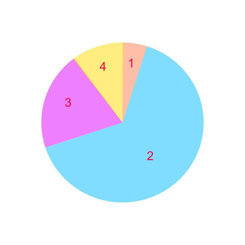
Considering the number of pens a student carries. The figure provides a form of graph that helps to answer questions that compare a data-value to the whole or combining two or more neighboring data values to compare.
This is called pie-chart.
This represents the following as segments in circle
• frequency of is , which is represented as a segment of orange color.
• frequency of is , which is represented as a segment of blue color.
• frequency of is , which is represented as a segment of purple color.
• frequency of is , which is represented as a segment of yellow color.
The total is .

The word "pie" means: a circular dish, usually cut in angular segments and served.
summary
Pie Chart : A representation of data as segments of a circle or a disc.
examples
Consider the data:
• frequency of is
• frequency of is
• frequency of is
• frequency of is
The total is The circle represents the total . In that case,the angle in the segment representing is
.
Drawing a pie-chart: The total is which represents whole circle with angle.
• Frequency of is , and that would be represented by a segment with angle angle.
• Frequency of is , and that would be represented by a segment with angle angle.
• Frequency of is , and that would be represented by a segment with angle angle.
• Frequency of is , and that would be represented by a segment with angle angle.
summary
Reading a bar graph : With the meaning attributed to horizontal axis and vertical axis, the position and height of each bar is read.
The objective is to answer any comparative or quantitative questions about the data using the given bar graph.
Multiple Data in a Bar-Graph : Multiple sets of data can be plotted in a single bar graph.Such bar-graphs are also used to answer any comparative or quantitative questions.
Pie Chart : A representation of data as segments of a circle or a disc.
Outline
The outline of material to learn "basics of statistics and probability" is as follows.
Note: Click here for detailed outline of "Basics of Statistics and Probability"
• Introduction
→ Introduction to Statistics
→ Organizing Data : Tally Table
→ Pictograph
→ Bargraph
• Data Analysis
→ Cumulative Frequency
→ Representative Values of Data
→ Central Tendencies
→ Bargraphs & Piecharts
• Probability Fundamentals
→ Predicting Future
→ Random Experiment
→ Probability
→ Standard Experiments
• Statistics Grouped Data
→ Grouped Data
→ Probability in Grouped Data
→ Class Parameters of Grouped Data
→ Methods to find Mean of Grouped data
→ Mode of Grouped data
→ Median of Grouped Data